Nick was honoured to be asked to provide the unique and iconic lettering for the Broadway production of ‘Diana A True Musical Story’. The brief was to create abstract freeform brush scripts that would compliment […]
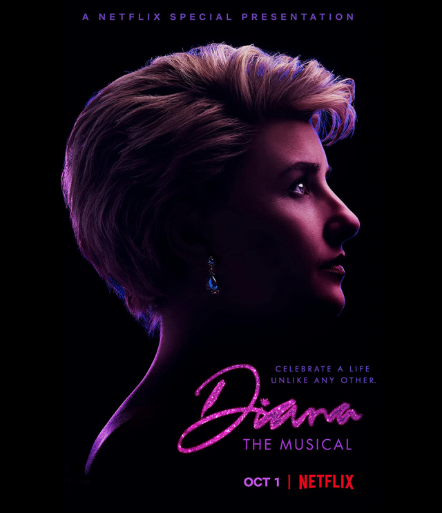
Nick was honoured to be asked to provide the unique and iconic lettering for the Broadway production of ‘Diana A True Musical Story’. The brief was to create abstract freeform brush scripts that would compliment […]
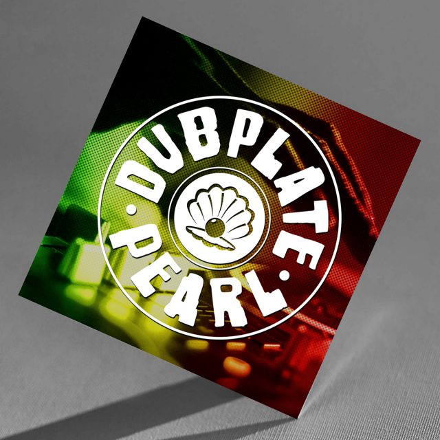
Dubplate Pearl of Camberwell Connection recently contacted us to help her with an identity and website for her Arts Council supported project Revival is Survival. Revival is Survival is an Arts Council supported project, showcasing […]
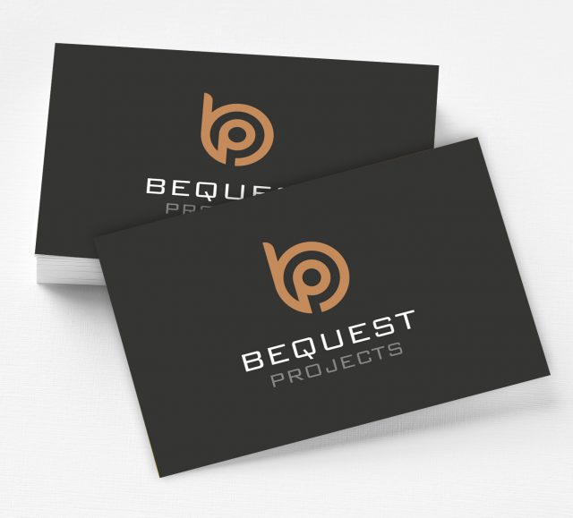
Bequest Projects tasked us with creating a brand identity that could be utilised across three existing specialist areas of the company. Keeping it simple and stylish we created a unique logotype that encapsulated the essence […]
Recently completed the refreshed identity for the Los Angeles based creative platform DECADENT. It was an enlightening journey in many ways and I’ve done my best to tell the story it in the narrative below […]
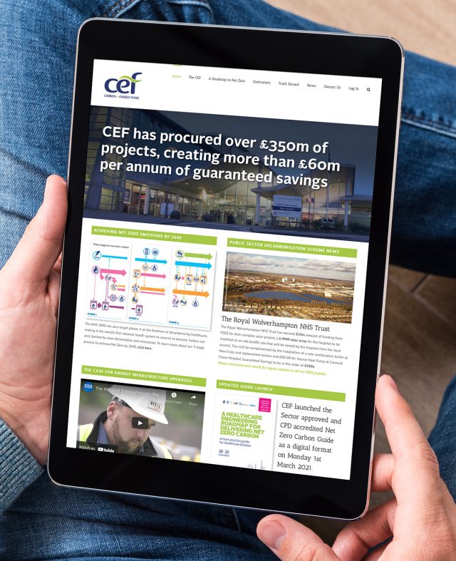
Launched by Greg Barker MP at IHEEM in 2011, the Carbon and Energy Fund was specifically created to fund, facilitate and project manage complex energy infrastructure upgrades for the NHS and wider Public Sector. With […]
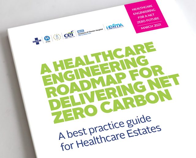
What initially started life as a typical credentials brochure design project for the Carbon and Energy Fund (CEF) has since become the ‘go to’ energy upgrade guide for all UK Healthcare Estates. Updated, reprinted and […]
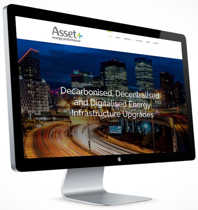
Having known the directors of this new start up from their time at Mitie Asset Management and subsequently Imtech UK, we were more than familiar with the sector and culture this new energy venture plans […]
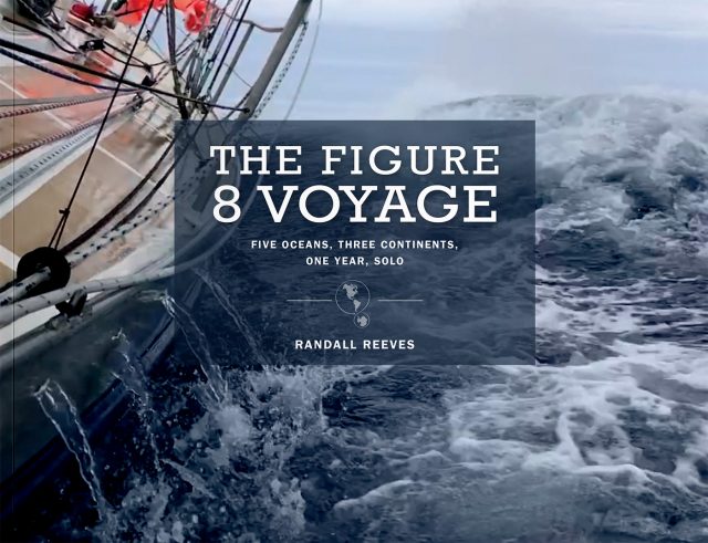
At last we can tell you about the Figure 8 Voyage Coffee Table Book. This stunning 100 page perfect bound picture book tells the story of the Figure 8 Voyage through imagery and daily reports from […]
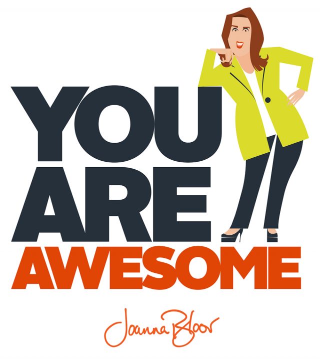
Joanna Bloor is one of those people who inspires others. Following her smash hit TED talk in 2018 she has been in demand as a speaker and life coach across the United States. Fanatical about […]
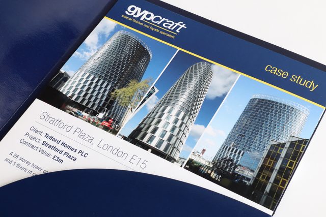
We are fortunate to be the designers and brand guardians for Gypcraft, one of the South East’s leading internal finishes and façade specialists. In six years we have seen them grow from an annual turnover […]
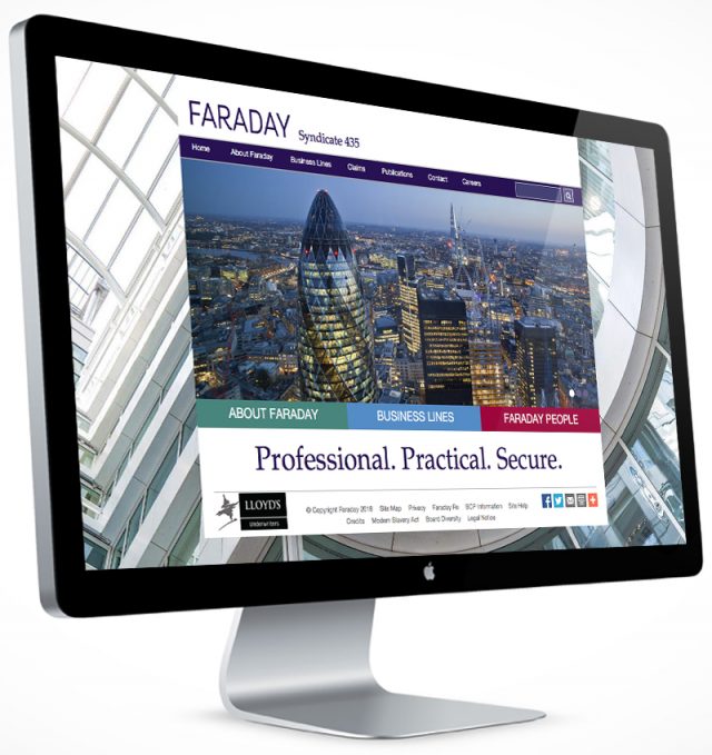
Faraday Underwriting is part of the Gen Re Corporation, a wholly owned subsidiary of Berkshire Hathaway. Through our relationship with another well known underwriter we were invited to look at various marketing pieces including quarterly […]
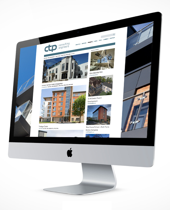
CTP Consulting Engineers are consulting civil and structural engineers based in Kent and work both nationally and internationally. The founders approached us to create a full branding system refresh including identity redesign and a detailed […]
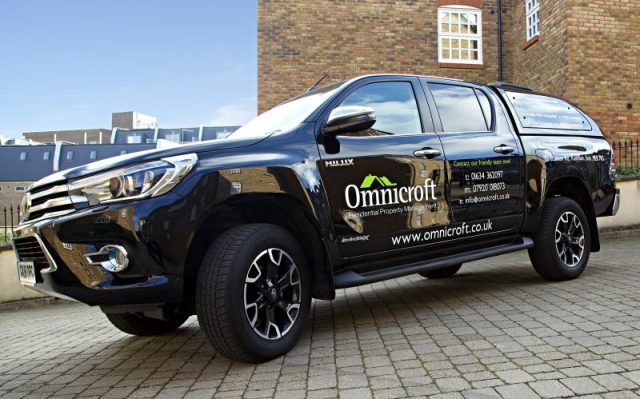
Established in October 2007, Omnicroft Residential Property Management is a residential property management company based in Kent that provides maintenance, management and consultancy services to developers, freeholders and residential management companies across Kent and London. […]
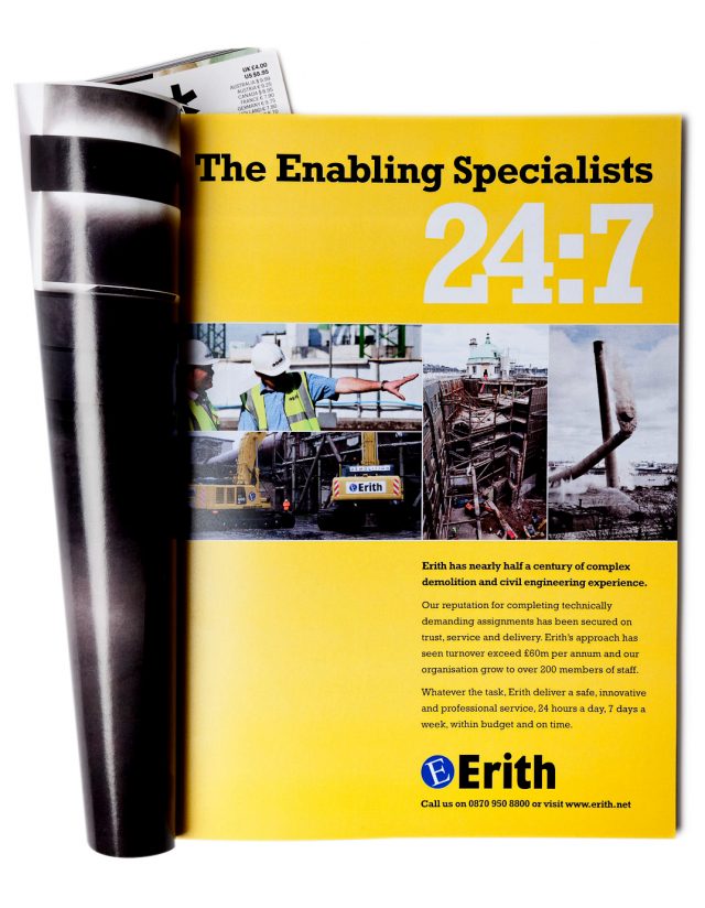
When we first met Erith, they were known simply as a demolition company, even though their service offer was far more diverse. Our mission was to find a way to unite all of their services and reposition […]
Pads4Let Medway, formerly known as Pads4Grads, is a reputable privately owned family business based in North Kent, providing quality houses and single room accommodation for rent in Gillingham, Medway, for young working professionals and students. […]
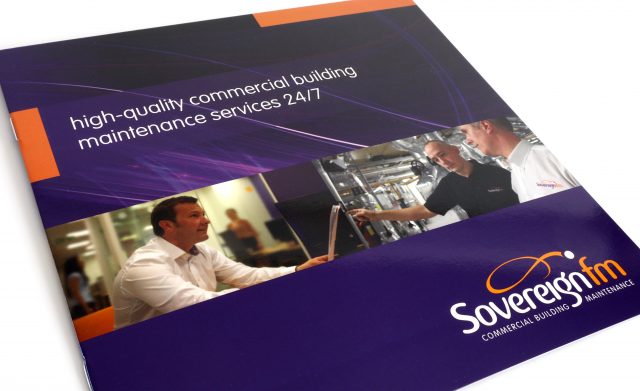
SovereignFM Commercial Building Maintenance – a City of London based facilities management company – requested a complete brand refresh and to be repositioned within its’ market sector as a more contemporary, dynamic and visually distinctive […]
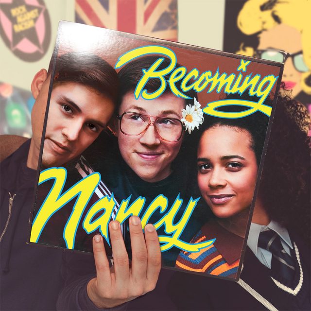
Broadway creative genius Drew Hodges approached Nick to create the titles for the new musical production of ‘Becoming Nancy’. The title treatments for Becoming Nancy are based on the type originally created for the iconic […]
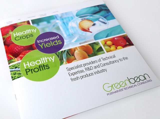
Greenbean Scientific are a small specialist science based company providing a blend of technical services, R&D and specialist post harvest advice to help clients reduce postharvest losses, improve quality and safety, extend shelf life and […]
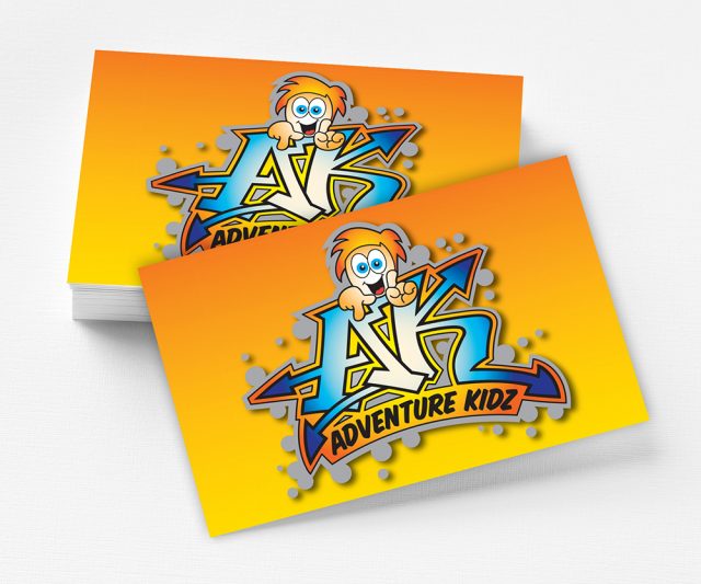
This is a new start-up where the owners came to us with a name and a blank canvas. We workshop developed the name Adventure Kidz with AK becoming the name for our main hero. Using […]
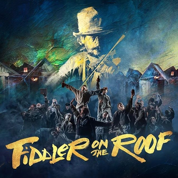
Bob King Creative approached Nick to create the title lettering arrangement for the forthcoming version of the iconic musical Fiddler on the Roof hosted at the Playhouse Theatre, London. The underlying concept for Fiddler of […]
Medway Norse, part of the Norse Facilities Management Group, approached us to help name and create a brand identity for their ever expanding catering unit servicing: local government offices, commercial hubs, schools, civic leisure centres […]
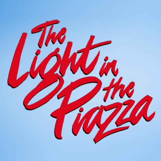
Bob King Creative approached Nick to create a hybrid retro/contemporary script lettering treatment for the London show – The Light in the Piazza. The underlying concept for The Light in the Piazza was to balance […]
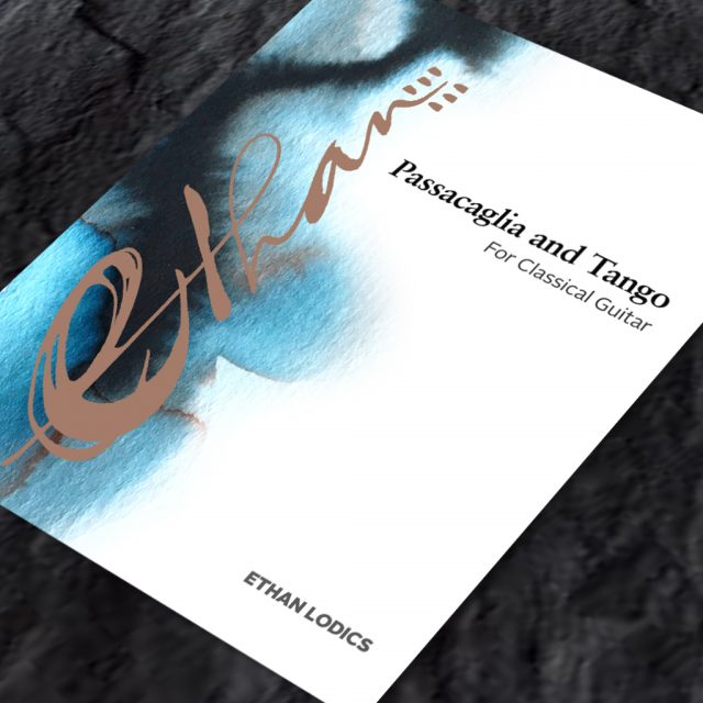
Following on from Nick’s participation in Inktober 2018, he was contacted by Ethan Lodics an artistic director, composer and guitar player living and working in North Carolina, USA. Ethan Lodics requested a visual identity and […]
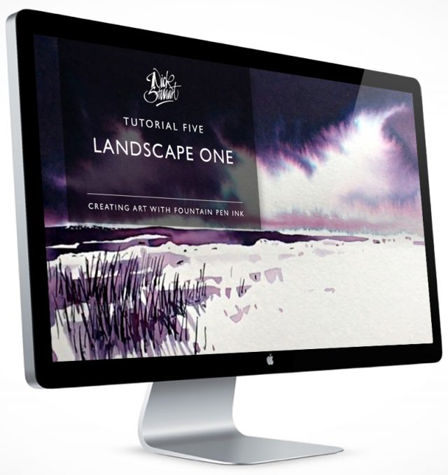
Nick has recently released his new brand new Fountain Pen Ink Art – The Basics course on Udemy.com. Featuring 12 step by step tutorials and lasting 1 hour 20 minutes in duration, the video has […]
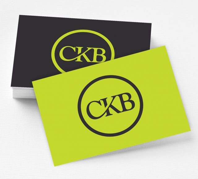
Courtesy Kitchens and Bathrooms tasked us with creating a group brand CKB identity that could be utilised across existing and future divisions of the organisation. Keeping it simple and stylish we created a unique ligature […]
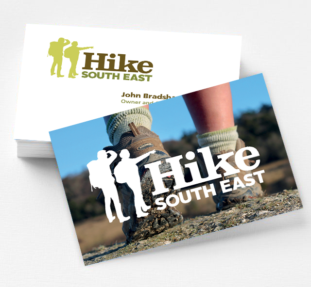
This is a recent commission from a keen hiker who regularly walks and explores the areas of outstanding natural beauty across Kent, Surrey and Sussex, with a dream to share his passion. He wanted a […]
Humans are constantly fascinated with auto-operating AI-driven gadgets. The latest trend that is catching the eye of the majority of the tech industry and now the PR industry, is chatbots. And with so much research […]
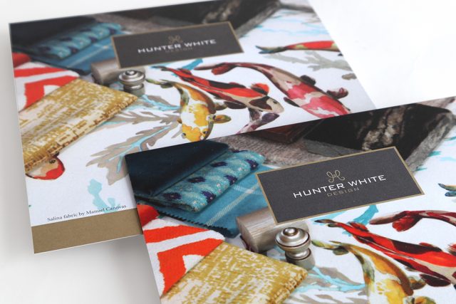
Hunter White Design is an ambitious interior design and interior architecture consultancy based in Hampshire needed a brand identity, website and marketing material with distinction, presence and individuality. The Hunter White Design monogram is the […]
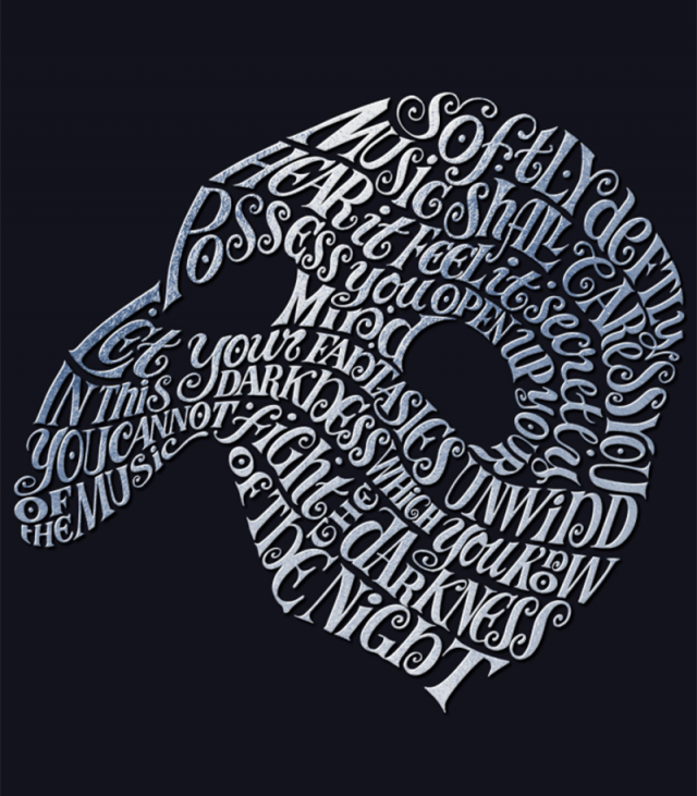
Bob King Creative approached Nick to create a hand lettered mask as a marketing piece for Sir Andrew Lloyd Webber’s iconic musical the Phantom of the Opera. The underlying concept for the Phantom of the […]
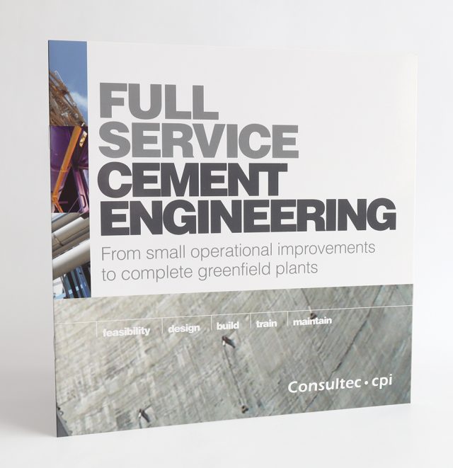
Cement Performance International is a leading consultancy business for the global cement industry. Stewart2 were commissioned by Cement Performance International (CPI) to create visual communication showcasing their their partnership with Canadian cement specialist Consultec. Our […]
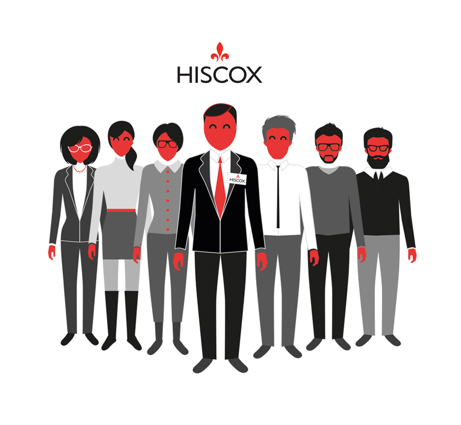
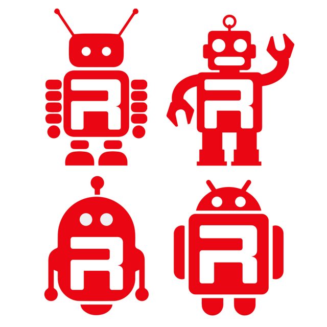
Many large organisations like Hiscox, have complex and detailed brand guidelines that need experienced designers to understand and action as instructed. The Peloton.TV approached us to create seven characters for a short corporate video they […]
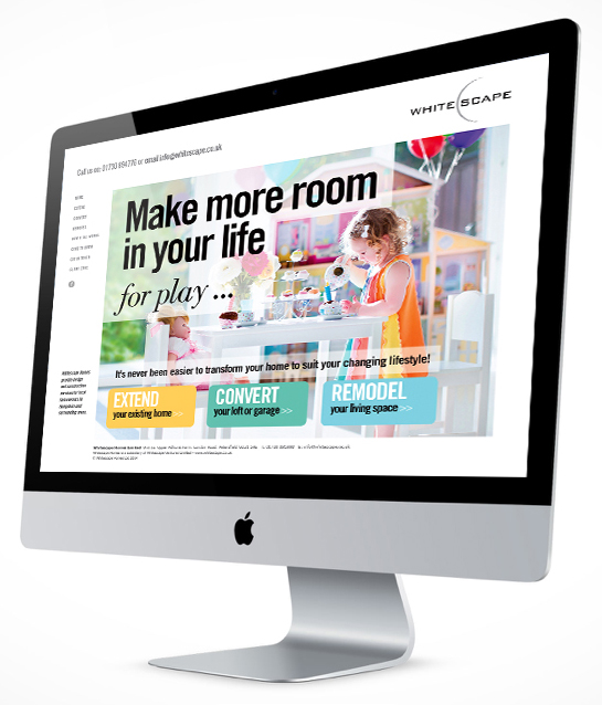
Whitescape Homes is part of the Whitescape Ventures Group. Our mission was to create a B2C website exuding aspiration with a magazine style feel while still adhering to the Whitescape branding guidelines which we designed […]
The construction business is no longer just about meeting budgets and deadlines. The whole way buildings are put together has to be smarter, more economic and sustainable. Best practice is our minimum standard. In this […]
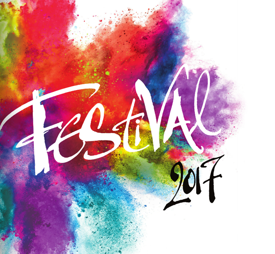
Bob King approached Nick to create the title lettering for the Chichester Festival. Several alternative design routes for the Chichester Festival were also submitted but the energy and freedom of our lettering won the day. […]
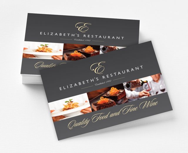
Elizabeth’s Restaurant in Rochester approached us for a brand refresh, new website and printed marketing material. As one of North Kent’s better restaurants, Elizabeth’s Restaurant were well aware of what they needed to do but […]
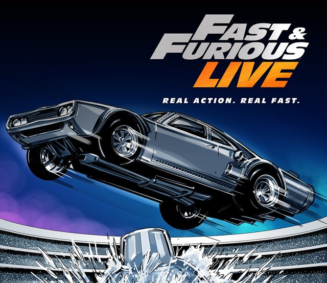
Working with production agency Fracture Clinic, we were asked to take scenes from the recent Fast and Furious films and visualise them digitally into the UK venue where the live shows were to be hosted. […]
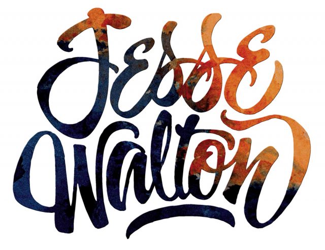
Folk singer and song writer Jesse Walton approached us to create the packaging for his debut album ‘Into the storm’. With the only stipulation from Jesse Walton being that we utilise a watercolour created by […]
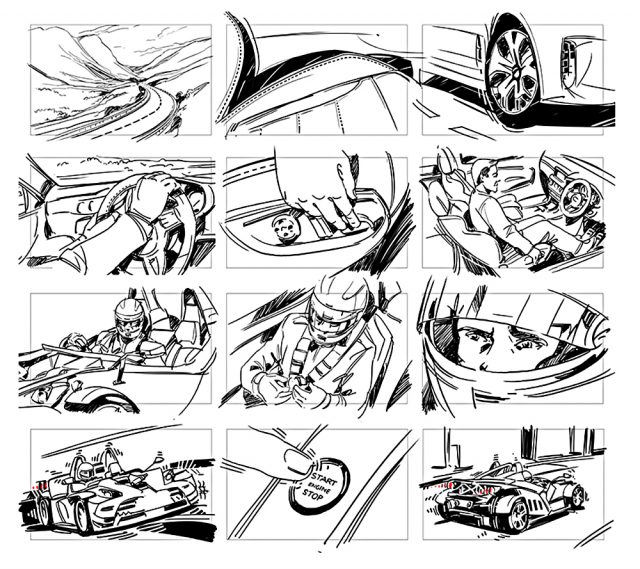
Working with the production agency Fracture Clinic, we were tasked with storyboarding 56 pencil style frames for a new KIA car video. The images created for Fracture Clinic were created digitally and supplied as hi res […]
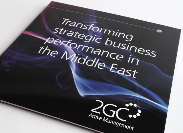
2GC approached us to design a dual language brochure for their UK and Middle East promotional activities. As 2GC are specialists in strategic business performance we needed a subtle concept that suggested change without detracting […]
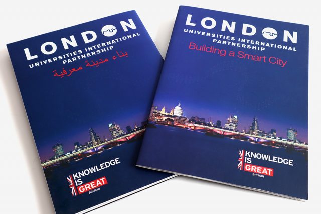
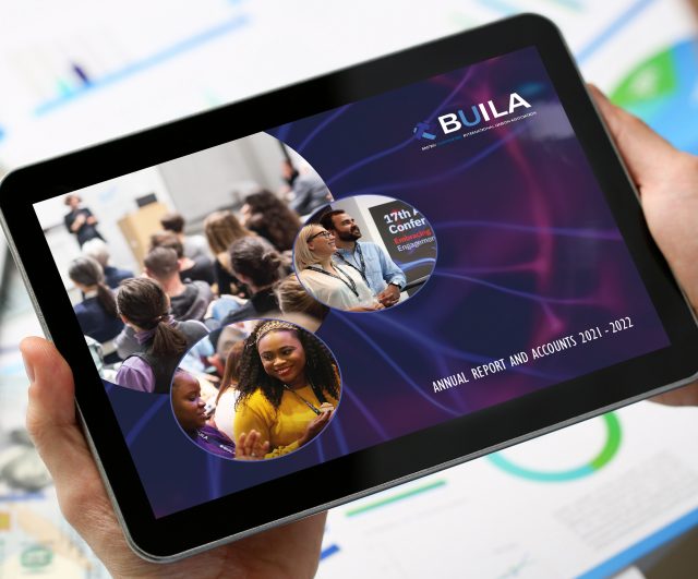
The London Universities International Partnership (LUIP) commissioned us to design the marketing collateral for their most recent travelling showcase to Qatar and Abu Dhabi. Evolving the LUIP corporate guidelines to embrace the Great Britain brand guidelines […]