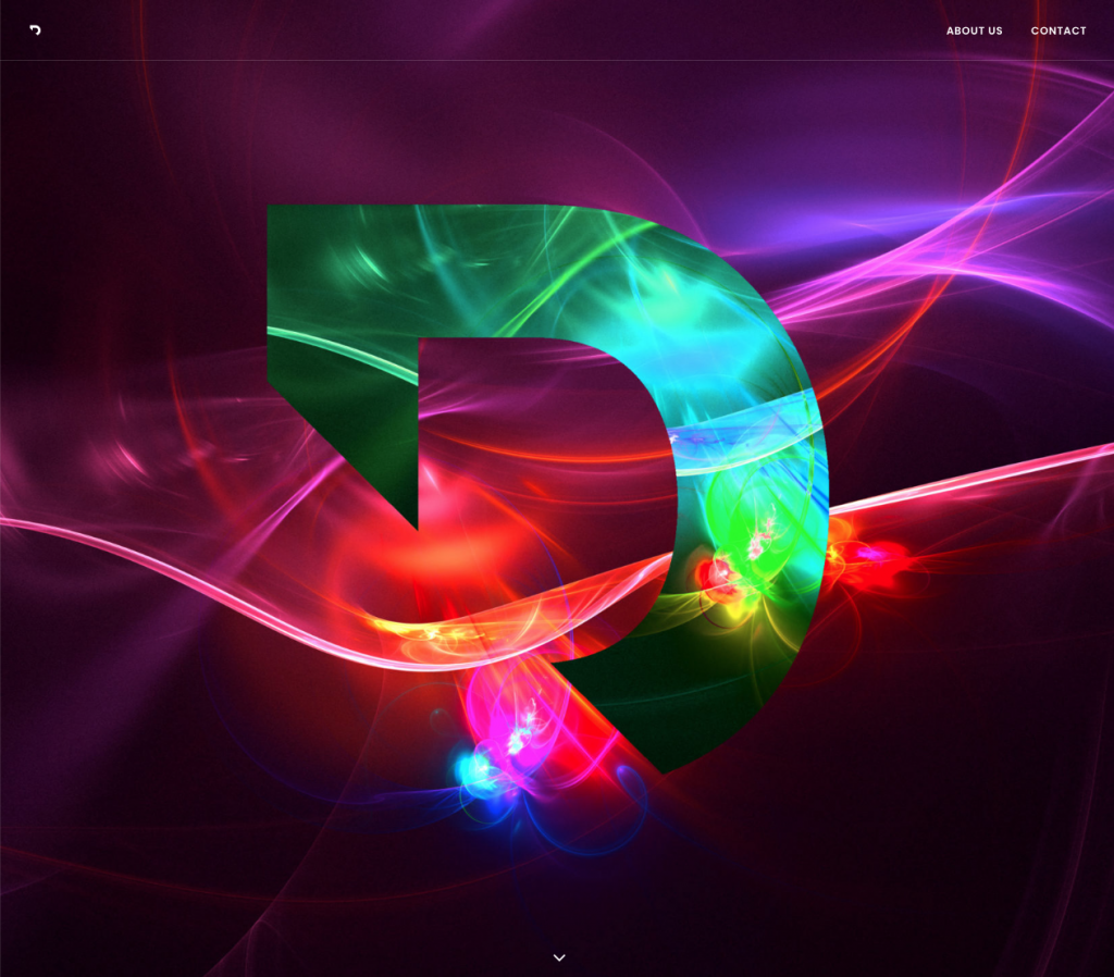
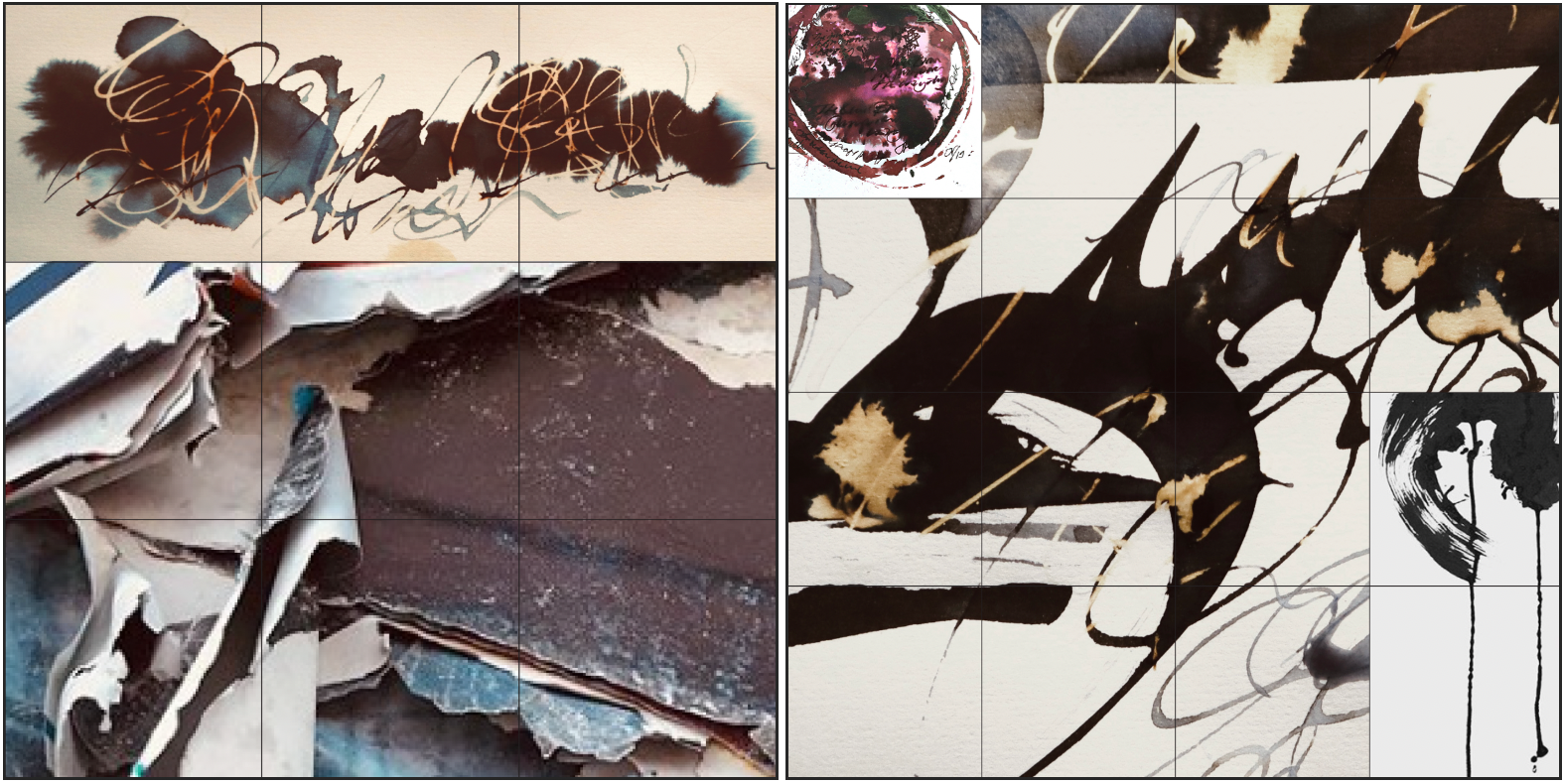
Recently completed the refreshed identity for the Los Angeles based creative platform DECADENT. It was an enlightening journey in many ways and I’ve done my best to tell the story it in the narrative below a couple of the many mood boards that were created for the project.
Initially, I thought the name Decadent was a reference to the Decadent Movement of the late 19th century: Subverting the traditional rules of literature and art, The ‘Decadents’ pursued a life of sensual expression, hedonism and creativity. But, with further discussion it was clear the team wanted to reflect the deeper origin of the word: the decline of a ‘golden age’ through economic stagnation, institutional decay and cultural and intellectual exhaustion – perfectly describing the world today. Like it or not- we are living in a ‘decadent age’.
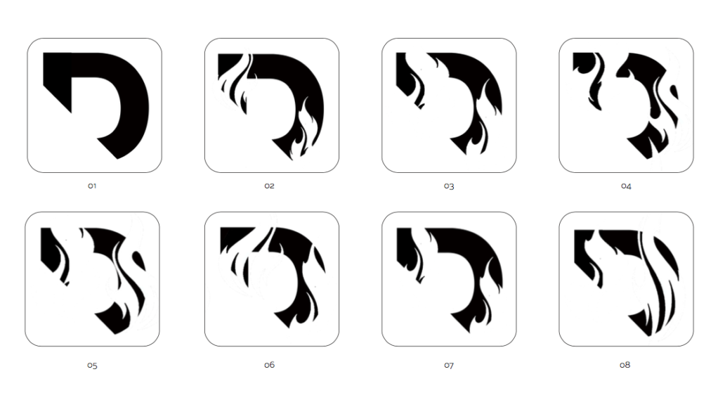
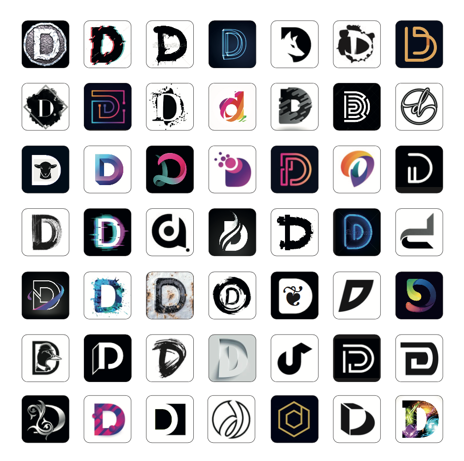
From the outset, we were looking for an icon that would represent a clever, sophisticated and appropriately named creative platform for our time. Hundreds of abstracted typographic and calligraphic marks were submitted along with a plethora of visual textures and treatments. Through an extensive creative process of exploration, experimentation, refinement and selection, the final abstracted ‘D’ came to be. Robust, stylish and unique, the letterform reflects the intentions of an international creative force; because the ‘D’ is in fact a paradox. It’s degenerated, yet this degeneration has become a positive. The inevitability of decline, frustration and insecurity has been replaced with something fresh and new. Exuding ethereal colour and energy this ‘D’ is a symbol of creativity, confidence and strength. An icon of hope for a ‘decadent age’.
Click here to check out the Decadent.World creative platform and click here to visit Nick’s type site.