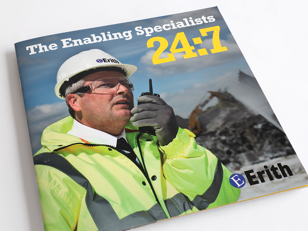
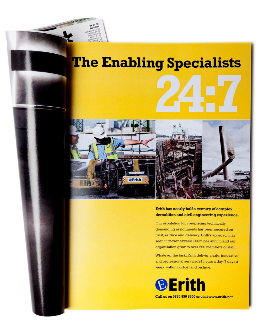
When we first met Erith, they were known simply as a demolition company, even though their service offer was far more diverse. Our mission was to find a way to unite all of their services and reposition them as a division one player that could offer the complete envelope solution.
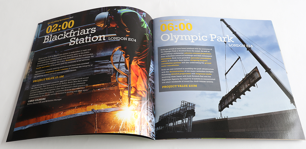
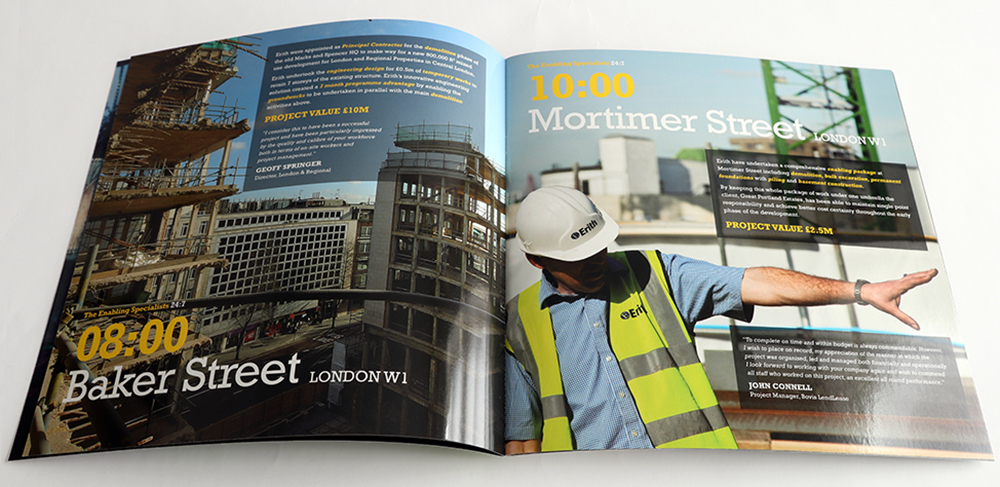
We embarked upon a series of workshops searching for a descriptor that succinctly defined them. ‘Enabling’ happened to be a key adjective within the sector that no other company was utilising, so we took it. With the ‘Enabling Specialists’ agreed to and annexed to the company logo, we set about telling their story as a dynamic and dramatic 24:7 journal featuring graphic images and words, showcasing the scale, complexity and diversity of live projects happening in and around London and the the South East. Using the distinct Rockwell typeface for all headline copy we designed and produced: a launch party, advertising, printed marketing collateral, uniform and livery templates, an in-house editable website and a brand guidelines document.
The repositioning project had an dramatic impact in terms of market perception and turnover increase. Erith are now top of the first division and one of the largest ‘enabling’ companies in the europe. The distinct branding is easily recognisable across London and the South East.
