Nick was honoured to be asked to provide the unique and iconic lettering for the Broadway production of ‘Diana A True Musical Story’. The brief was to create abstract freeform brush scripts that would compliment completely the watercolour portrait of Diana.
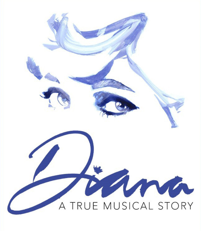
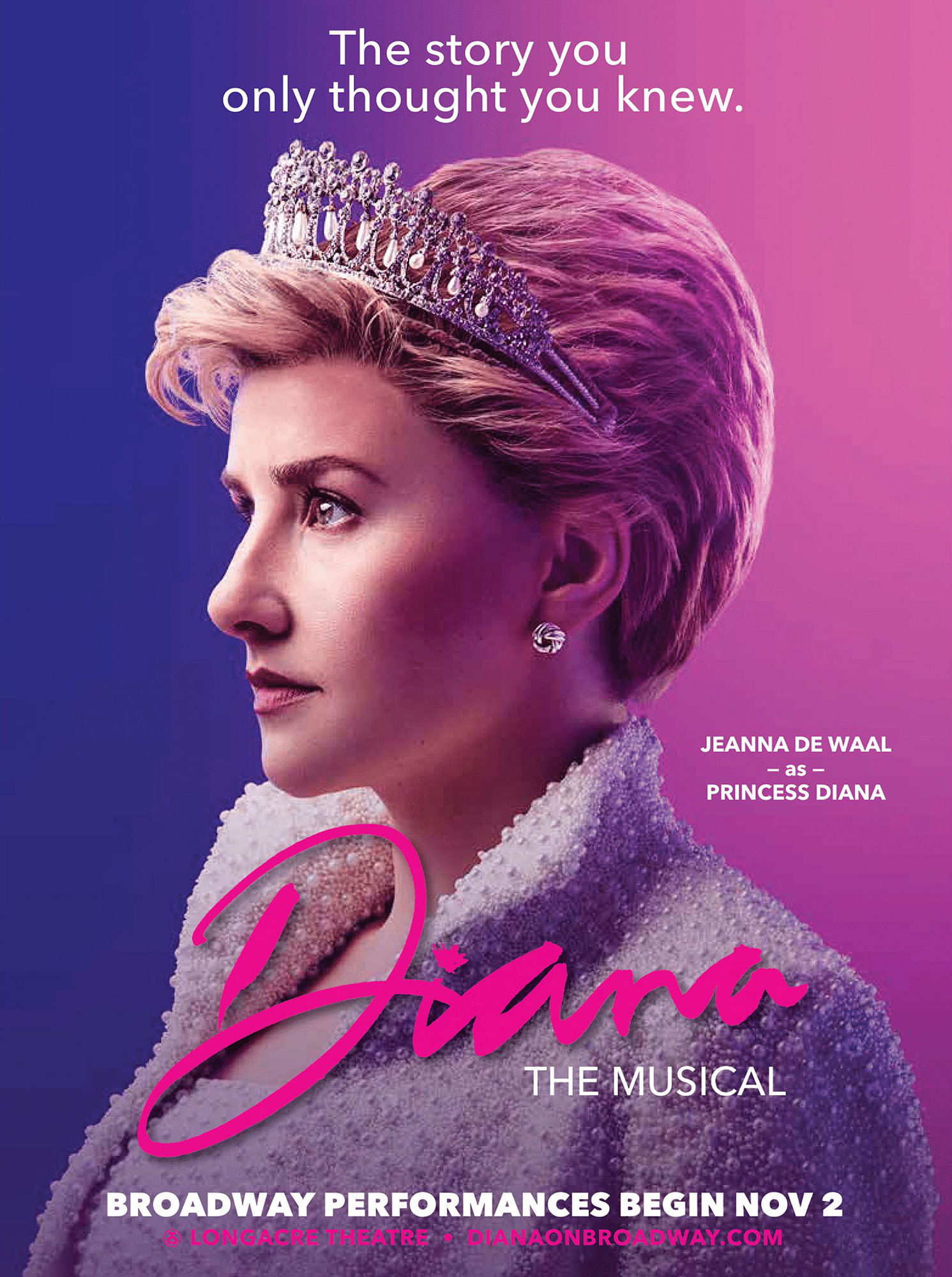
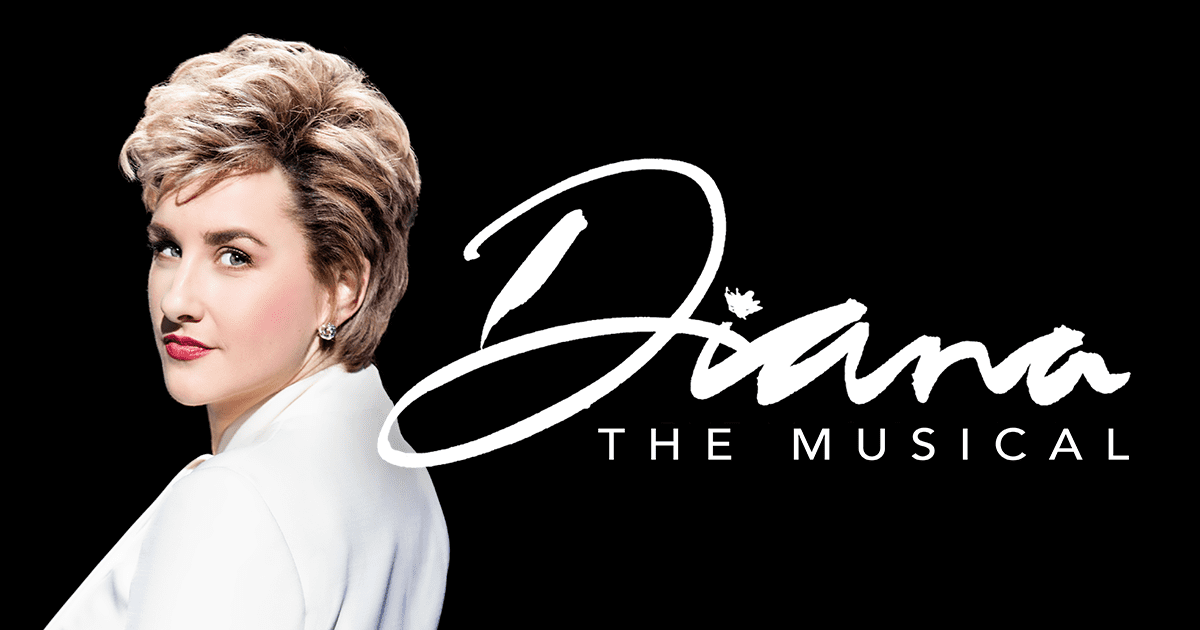
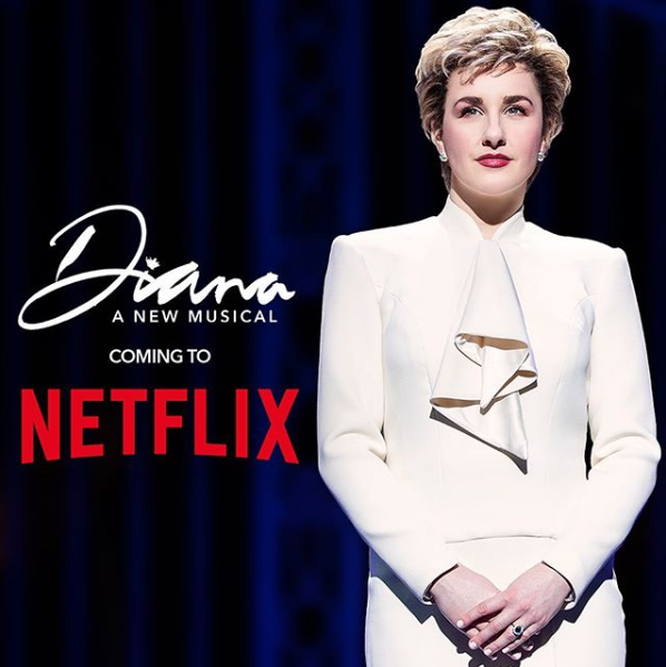
Not as easy as one may think. Many styles were explored until ‘it’ finally happened – as it always does! The next challenge was to create the other headlines in a similar style. All the lettering was created with a Chinese brush using Quink black fountain pen ink on Seawhite cartridge paper.
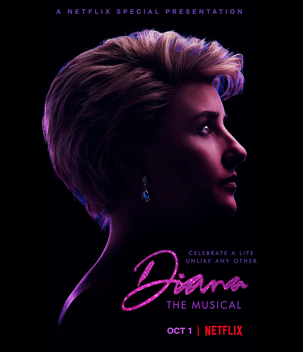
One of the most satisfying outcomes of this project is how easily recognisable and accessible the brand identity has become internationally. Netflix have adopted it for their own release of the show, which is high praise indeed, as they usually create their own ‘hi impact easy read’ title treatments in-house.
Many thanks to Drew Hodges for his trust with this very special commission.
If you have a project that needs a unique hand lettering style and identity – Click here for Nick’s lettering website
