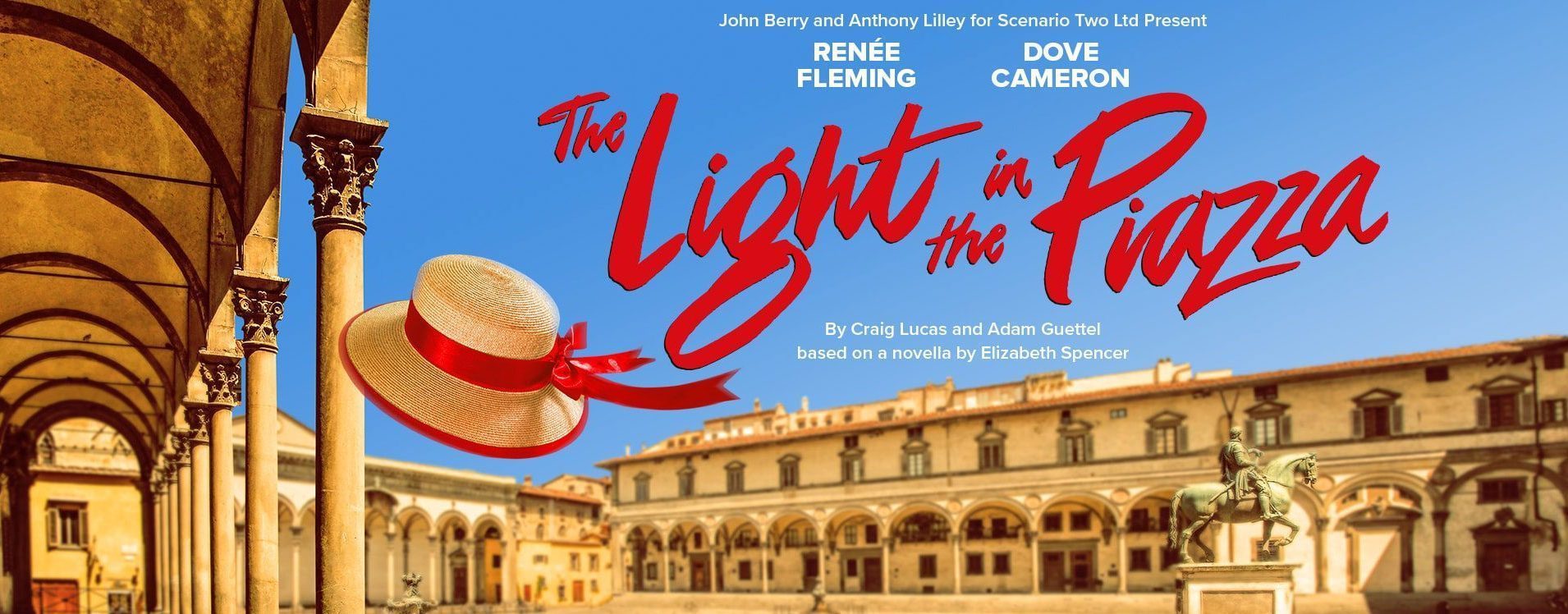
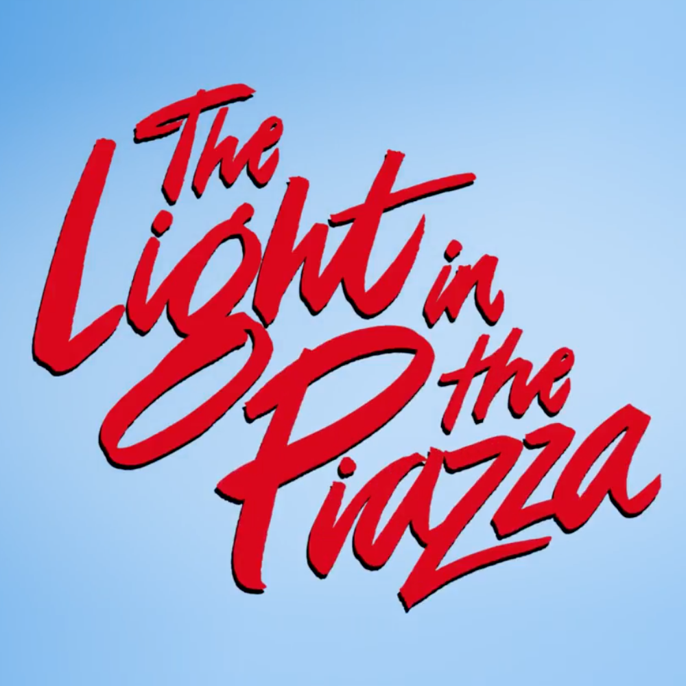
Bob King Creative approached Nick to create a hybrid retro/contemporary script lettering treatment for the London show – The Light in the Piazza.
The underlying concept for The Light in the Piazza was to balance the title treatments between a retro brush style synonymous with the 1950’s and a more contemporary abstract approach with movement and passion.
We have been privileged to know and work for Bob King since his days as Creative Director at Dewynters plc.
Click here for Nick’s lettering website